
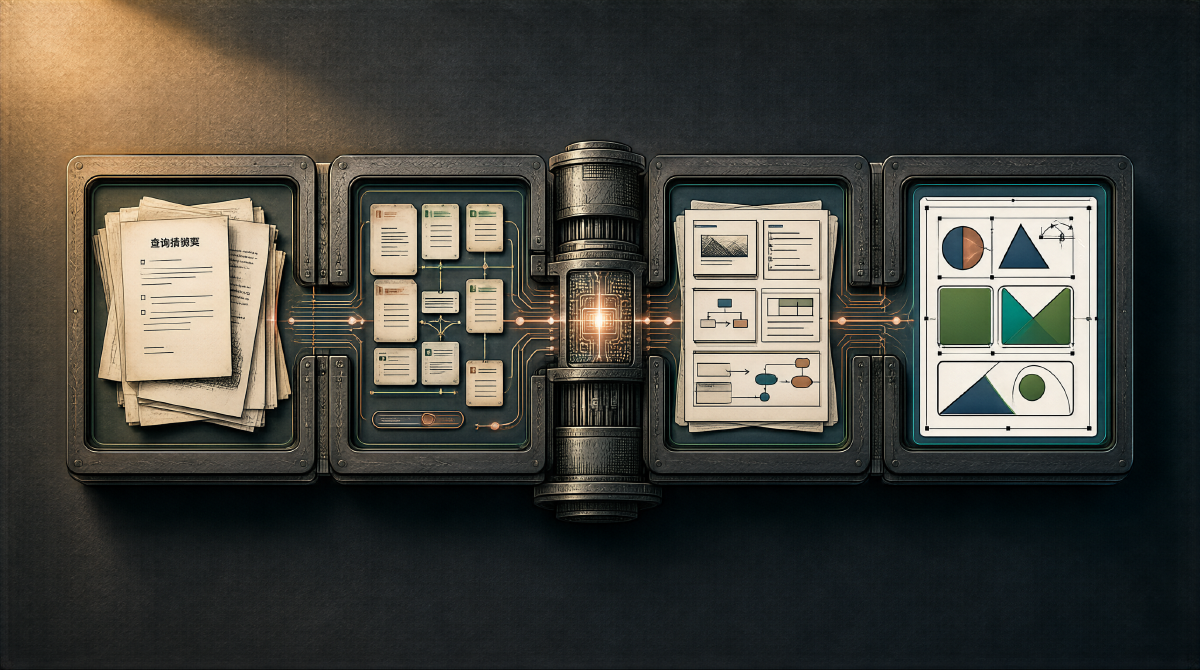
Conclusion first: this is not another “type a topic → force it into a template → output garbage” AI PPT tool.
It runs a complete expert workflow — requirement research, material retrieval, outline planning, layout planning, visual design — where every step allows manual fine-tuning, or the whole thing can run automatically end to end. In terms of output, pages generated with Gemini 3 Flash already reach commercial delivery quality.

The whole approach comes from a share by sandun (三顿) on Linux.do — seven years teaching PPT, three years building AI products. Below, stage by stage.
Why Every AI PPT Tool on the Market Disappoints #
Nearly every AI PPT tool follows the same flow: you type a topic, it instantly spits out an outline, then stuffs content into templates. Nowhere in the process is there any “understanding the requirement” step.
But the professional process for making decks doesn’t work that way. Professional design firms employ dedicated planners who first nail down three questions: who is this for? What is it saying? What outcome is it driving at? Only then does anyone start writing.
This agent ports that professional flow over.
Stage 1: Requirement Research — Ask Before Doing #
Given a topic, the agent’s first move isn’t generating an outline — it searches for relevant material, then questions the user like a consultant:
- Who is the audience for this deck?
- What is the core message to convey?
- Are there any must-include data points or case studies?
This step uses a structured prompt casting the AI as a “PPT structure architect,” with the Pyramid Principle as the core methodology — conclusion first, upper levels govern lower levels, group like items, progress logically.
The full prompt:
|
|
The output is a structured JSON outline where every page has a title but no concrete content yet.
Stage 2: Material Retrieval — Putting Flesh on the Skeleton #
The outline is the skeleton; content is the flesh. This step takes each page title from the outline apart and runs search and information gathering one by one.
The project uses a domestic search API, but if you’re DIYing it yourself, sandun’s recommendation is to use Grok directly — feed it the outline titles one by one and it searches, organizes, and summarizes automatically.
The key point: never let the AI invent content out of thin air. Every piece of information should have a source, whether financial report data, technical documentation, or industry reports. How well this step is done directly determines the credibility of the final deck.
Stage 3: The Planning Draft — Lock the Layout Before Design #
This is the stage most AI PPT tools lack, and the core difference behind professional design firms quoting 10,000+ RMB per page.
The planning draft is a simplified page mockup — no flashy styling, just the placement of content and the layout plan. What element goes in which position on each page, and in what layout, all gets locked down.

In practice, splitting planning and design into two steps for the AI works far better than doing it in one shot. The planning step owns content organization and layout planning; the design step owns style and visuals — each does its own job.
Users can fine-tune content at this stage and run the design after confirming. Or never intervene and let the AI run the whole thing.
Stage 4: SVG Rendering — Bento Grid Is the Key #
This is the most interesting part.
The layout uses a Bento Grid (bento-box layout) — packing content into cards of different sizes, arranged like a Japanese bento. The visual web pages in Apple keynotes and Xiaomi’s annual reports both follow this idea.
Three reasons for choosing Bento Grid:
- High information density: a single page carries plenty of content without looking empty or cramped
- Flexible layout: card count, size, and position combine freely, with no dependence on fixed templates
- AI can understand it: the most critical one. “Cards” are the design language AI grasps most easily — far more controllable than free-form layout
The full Bento Grid layout specification:
|
|
The full SVG rendering prompt:
|
|
Layout combinations can be single focus, symmetric/asymmetric two-column, three-column parallel, top hero, mixed grid, and so on — entirely content-driven.
The output format is SVG rather than HTML. Reasons:
- SVG imports directly into Office 2016+ and stays fully editable
- Every design tool (Figma, Sketch, Illustrator) supports it
- Vector format — scale infinitely without blurring
- The cost is that parsing and rendering SVG took enormous engineering work — nobody had done it, so everything started from zero
If you don’t need editability, HTML is easier to generate, and Gemini’s HTML output quality is high too.
Real Output and Cost #
The screenshots at the top of the article are all Gemini 3 Flash output. For higher quality requirements, step up to Gemini 3.1 Pro.
On cost: Flash pricing is low enough that running the complete pipeline stays within acceptable bounds. The Pro version looks better but doubles the cost — save it for important occasions.
The Shortest Path to Reproduce It Yourself #
If you want to run this pipeline yourself:
- Use the Pyramid Principle prompt to generate a structured outline (full prompt above)
- Use Grok to retrieve material page by page
- Have the AI generate a simplified planning draft
- Use the Bento Grid + SVG prompt to generate the final design
No coding is needed for the whole process — just feed each step’s output into the next step. The key is to skip no step — especially the planning draft.
A Few Observations #
What makes this pipeline work isn’t any single brilliant prompt — it’s decomposing a human expert’s workflow cleanly, then having AI execute it step by step. The planner/designer division of labor applies to AI just the same.
This approach probably uses only 5% of what AI can do for PPT. The SVG format itself still has plenty of limitations — style consistency across pages, complex animation, and chart rendering remain open problems. But as a mid-2026 solution, it already reaches a commercially usable level.